Samples:
Copywriting and Design Samples
& Comparisons
Why is difficult to judge just how good a particular writing piece is, or a graphic design for that matter? What does it solve? What? If you are only looking at the final result, say a column in a document like a newsletter, a sales letter, a brochure, what is missing often is the purpose, the objective, what the problem is that the item solves. Often the importance and what it solves is unseen. When every contact asks for an explanatory brochure, and the company doesn’t have one, the solution is having a brochure. But unseen, and then just seeing the brochure without the solution, the meaning and impact is lost. As the problem is unseen, that being said you have go on what you can see – you have to go on something. So, if the purpose can be stated or demonstrated, or there is a comparison, that can help. Did the piece work? Did it do its job? Here are some items and comments.
Before and After Newsletters
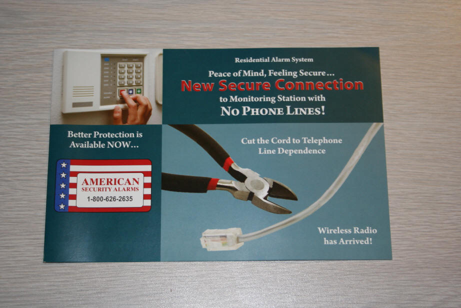
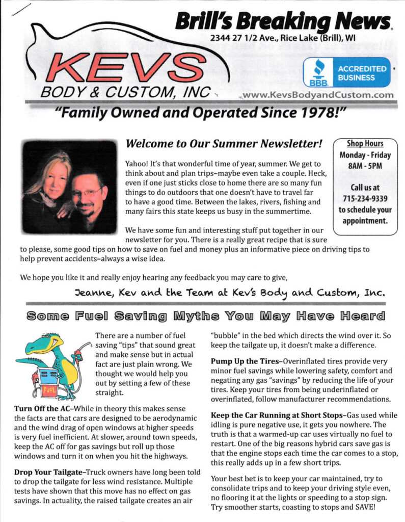
On the LEFT is a BEFORE IMAGE of the front page of a PREVIOUS 4 page newsletter for Kevs Body and Custom.
CLICK ON THE IMAGE TO VIEW LARGER SIZE. Opens or downloads.
.
On the RIGHT is an AFTER IMAGE sample of the new issues we produced with professional graphic design principles applied. Difficult to judge the writing, but it is greatly improved. All contact info appears logically on the front page, including Facebook address, website, shop hours, BBB, etc. Complete at a customer’s fingertips. The new and revamped issues are overall clean and attractive and easy on the eyes, including sharp images throughout. CLICK ON THE IMAGE TO VIEW LARGER SIZE. Opens or downloads. THEN CLICK AGAIN TO ENLARGE!
.
FROM JEANNE LUSSON, KEVS, ON THE REVAMPED NEWSLETTER:
.
“We are glad to endorse you, everyone mentions the newsletter to us all the time, how wonderful they are written and look. We love our newsletters, and we are really glad to have you doing them. Thank you so much!”
— Kev & Jeanne Lusson, Kevs Body & Custom, Inc., Rice Lake, WI
What was the problem? In the BEFORE instance, and much of what you can’t really see, the writer and producer did not have much experience or creativity for a start. Instead of charging right in and developing good content, they put it off until the last minute, and then some. Always late. Design, layout, fonts, and more were inconsistent and substandard on the whole, and clip art was marginal. Producing the newsletter on a timely basis was sorely lacking, always behind, and very frustrating for the owners. All of this disappeared when we took over, and the newsletter went out like clockwork. Enjoyable to work on.
Before & After Brochures
Below is the brochure for Commtrol,
BEFORE on the left and AFTER on the right.
This panel shows BEFORE. They had no brochure.
“Thank you Don and Kristen. This really explains what I do. Very good.”
R. Glassman, President, Commtrol
NOTE: Intangible services need much explanation.

Below, a successful brochure where none existed before. From scratch.
The cover is shown. DESIGN, COPYWRITING. GRAPHIC DESIGN. ILLUSTRATION.

For many more samples, please see also: Copywriting-Services and Home page.


